
Stay Updated with the Latest Insights and Tips
Welcome to our blog page! At 222 Websites, we share valuable content designed to help your business thrive in the digital world. From web design trends to SEO strategies and digital marketing tips, our blog is your go-to resource for staying informed and ahead of the competition.
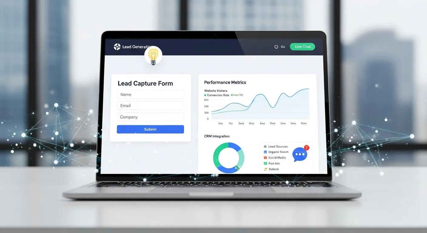
Boost Leads: Why Your Website Isn’t Converting Traffic
Why Your Website Isn’t Getting Leads Despite Traffic: Website Conversion Optimization Strategies
If your site brings traffic but not leads, visitors are arriving without taking action. According to HubSpot, 70% of websites fail to convert visitors into leads due to poor user experience and unclear calls to action. Common causes include UX friction, weak or poorly placed CTAs, and distracting design. This article outlines why visitors fail to convert and gives practical steps—improve UX, simplify layout, and sharpen CTAs—so your site turns visits into measurable leads.
Research highlights the value of combining intelligent systems with varied digital marketing strategies to improve customer acquisition and conversion in e-commerce.
Intelligent Systems for E-commerce Conversion Optimization
Global e-commerce is projected to exceed USD 8.03 trillion by 2025, increasing demand for intelligent systems that can integrate and optimise diverse digital marketing strategies. To address this, the authors propose a cross-channel transformer framework that unifies heterogeneous marketing data streams for better customer acquisition and conversion. A contextual embedding module captures temporal engagement dynamics, while a conversion-focused decoder outputs probabilistic predictions for customer actions. Evaluation uses quantitative metrics—Click-Through Rate (CTR), engagement, and conversion rate—with explicit thresholds for interpretability. The proposed Cross-Channel Transformer outperformed baseline models, achieving 90.8% CTR accuracy, 86.3% engagement prediction, and 84.7% conversion accuracy.
Intelligent Systems for E-Commerce: A Cross-Channel Transformer Framework for Customer Acquisition and Conversion Optimization, L Khoshaim, 2026
What Are the Common Reasons Your Website Gets Traffic but No Leads?
Start by identifying the usual blockers: unclear intent, hidden or weak CTAs, and site design that prevents engagement.
Lack of Clear User Intent: Visitors may not find the content or offer they expect, which raises bounce rates. Studies show that 55% of visitors spend fewer than 15 seconds on a website if they don’t immediately find relevant information (Nielsen Norman Group). Furthermore, a report by Forrester Research found that 70% of online businesses fail due to poor understanding of user intent. As Jeff Bezos famously said, "If you do build a great experience, customers tell each other about that. Word of mouth is very powerful."
Unclear Calls to Action (CTAs): When CTAs are invisible or vague, users don’t know the next step. Research by Unbounce indicates that clear CTAs can increase conversion rates by up to 80%. Additionally, HubSpot reports that personalized CTAs convert 202% better than basic ones. According to marketing expert Neil Patel, "A strong call to action is the difference between a bounce and a conversion."
Poor Website Design: A cluttered or dated layout can stop users from engaging. According to Adobe, 38% of users will stop engaging with a website if the content or layout is unattractive. Moreover, Stanford University research shows that 75% of users judge a company’s credibility based on website design. As Steve Jobs put it, "Design is not just what it looks like and feels like. Design is how it works."
These issues reduce conversions. For conversion-focused agencies like 222Websites, addressing intent, visibility, and design is central to improving lead capture.
How Does Poor Website User Experience Affect Lead Generation?

UX decides whether visitors stay and act. Sites that are hard to use, slow, or poorly organised push people away. According to Google, 53% of mobile users abandon sites that take longer than 3 seconds to load (Think with Google). Additionally, Akamai reports that a 100-millisecond delay in website load time can hurt conversion rates by 7%. Watch for these principal UX problems:
Navigation Issues: Confusing menus and unclear paths make it hard for users to find relevant pages. According to a study by the Nielsen Norman Group, 88% of online consumers are less likely to return to a site after a bad user experience. Jakob Nielsen, a leading UX expert, states, "Users spend most of their time on other sites."
Loading Speed: Slow pages increase bounce rates because users rarely wait long for content. Amazon found that every 100ms of latency cost them 1% in sales. Google research also shows that as page load time goes from one to ten seconds, the probability of a mobile site visitor bouncing increases by 123% (Google Developers).
Mobile Responsiveness: If mobile visitors get a reduced or broken experience, you lose a large share of potential leads. Mobile devices account for over 54% of global web traffic (Statista). Google also reports that 61% of users are unlikely to return to a mobile site they had trouble accessing.
Improving navigation, speed, and mobile behaviour raises engagement and makes conversions more likely.
How Can Conversion-Focused Web Design Improve Your Website Lead Generation?
Conversion-first web design guides users to one clear next step by removing friction and highlighting actions. Core elements include:
Aesthetics: Clean, modern visuals capture attention and encourage exploration. Research shows that 94% of first impressions relate to design (WebFX). Furthermore, a study by the Missouri University of Science and Technology found that users form an opinion about a website’s appeal in 2.6 seconds. As Paul Rand, a legendary graphic designer, said, "Design is the silent ambassador of your brand."
User-Friendly Layouts: Simple, predictable layouts help users find information quickly. According to the Nielsen Norman Group, users spend 57% of their time on a page’s main content area.
Integration of CTAs: Well-placed, prominent CTAs direct users toward actions like signing up or requesting a quote. Research by WordStream shows that using a single CTA can increase conversions by up to 371%. Marketing guru Seth Godin emphasizes, "Don’t find customers for your products, find products for your customers."
222Websites designs with these principles so businesses see clearer, shorter paths to lead capture.
What Are Key Elements of Effective Landing Page Optimization?

Landing pages convert visits into leads. The most effective pages include:
Compelling Headlines: A concise, benefit-driven headline draws the user in. According to Copyblogger, 8 out of 10 people read headline copy, but only 2 out of 10 read the rest. Additionally, research by MarketingExperiments shows that a well-crafted headline can increase conversion rates by up to 30%. David Ogilvy, the father of advertising, famously said, "On the average, five times as many people read the headline as read the body copy."
Clear CTAs: Distinct CTAs tell users exactly what to do next. HubSpot reports that personalized CTAs convert 202% better than basic ones.
Trust Signals: Testimonials, reviews, and security badges reduce hesitation. BrightLocal reports that 87% of consumers read online reviews for local businesses, and 72% say positive reviews make them trust a business more. Nielsen Norman Group research confirms that trust signals can increase conversions by up to 42%.
The table below summarises their relative impact:
ElementDescriptionImpact LevelCompelling HeadlineGrabs attention and sets expectationsHighClear CTAsDirects users to take actionHighTrust SignalsBuilds credibility and reduces hesitationMedium
Used together, these elements make landing pages that reliably convert visitors into leads.
Which Call to Action Best Practices Boost Website Lead Capture?
Apply proven CTA rules—placement, design and testing—to improve lead capture.
Placement of CTAs: Put CTAs where users naturally look, such as above the fold and at article ends. Eye-tracking studies show users focus on the top-left and center areas of a page first (Nielsen Norman Group).
Design Considerations: Use contrasting colors and bold fonts so CTAs stand out visually. According to HubSpot, red and green CTAs have the highest click-through rates.
Testing Different CTAs: A/B test wording, color and placement to learn what resonates with your audience. Companies that use A/B testing see conversion rate improvements of up to 49% (VWO).
Follow these practices to make CTAs more noticeable and effective, increasing lead capture.
How Do Personalized and Mobile-Optimized CTAs Increase Conversions?
Personalised, mobile-optimised CTAs convert better by matching offers to intent and ensuring a smooth experience on phones.
Importance of Personalization: Tailored CTAs (by behavior or source) increase relevance and engagement. According to Epsilon, 80% of consumers are more likely to purchase when brands offer personalized experiences.
Mobile User Behavior: Design CTAs for thumb reach, clear labels, and fast loads on mobile devices. Google reports that 61% of users are unlikely to return to a mobile site they had trouble accessing.
Impact on Conversion Rates: Personalized, mobile-friendly CTAs typically produce higher conversion lifts than one-size-fits-all prompts. According to Salesforce, personalized CTAs can increase conversion rates by up to 202%.
How Can Analytics and A/B Testing Help Fix Low Website Conversions?
Analytics and A/B testing show where users drop off and which changes improve outcomes. Key tactics include:
Understanding User Behavior: Track interactions to identify friction points and high-exit pages. Google Analytics and Hotjar are popular tools for this.
Testing Different Elements: Run controlled experiments on headlines, CTAs, forms and layouts to measure gains. According to VWO, companies that run A/B tests are twice as likely to see conversion rate improvements.
Making Data-Driven Decisions: Use test results and analytics to prioritise changes that move the needle.
These methods create measurable conversion gains and stronger lead generation over time.
Research shows that combining strong design, usability principles and systematic A/B testing meaningfully improves website conversion rates.
Enhancing Website Conversion Rates Through Design, Usability, and A/B Testing
ABSTRACT: This research examines low conversion rates (CR) in e‑commerce through a phased case study. The authors used an A/B testing framework to identify factors behind low CR and proposed solutions based on interactive design, human–computer interaction principles, and industry design standards. They implemented these design changes in a web application and compared it with the case study site. The redesigned site showed improved usability and user experience, which in turn led to higher conversion rates.
Developing a new model for conversion rate optimization: A case study, 2013
What Metrics Should You Monitor to Improve Lead Generation?
Track a small set of metrics to find problems and prioritise fixes. The most useful are:
Conversion Rates: The share of visitors who complete desired actions (forms, purchases). Average website conversion rates vary by industry but typically range from 2% to 5% (WordStream).
Bounce Rates: High bounce rates suggest visitors aren’t finding what they expect. The average bounce rate across industries is about 41% to 55% (Contentsquare).
Lead Sources: Knowing where leads come from helps focus marketing and optimise landing pages. According to Salesforce, companies that track lead sources see 30% higher conversion rates.
Monitor these KPIs to identify weak spots and guide practical improvements to your lead-generation funnel.
Frequently Asked Questions
What role does content quality play in website conversion rates?
High-quality content builds trust and addresses user needs, which encourages action. Clear messaging, useful information and relevant visuals keep users engaged and move them toward conversion. According to Content Marketing Institute, content marketing generates over three times as many leads as outbound marketing and costs 62% less.
How can social proof influence lead generation on my website?
Social proof—testimonials, reviews and case studies—raises credibility. When visitors see positive experiences from others, they’re more likely to trust your offer and convert. BrightLocal reports that 91% of consumers trust online reviews as much as personal recommendations.
What is the impact of website speed on user engagement and conversions?
Speed strongly affects engagement: slow pages increase bounces and reduce conversions. Optimise images, enable caching and remove unnecessary code to improve load time and user satisfaction. Google found that as page load time goes from one to ten seconds, the probability of a mobile site visitor bouncing increases by 123% (Google Developers). Amazon also reported that a 1-second delay in page load time can lead to a 7% reduction in conversions.
How can I effectively use A/B testing to improve my website's performance?
Test one change at a time (headline, CTA, layout), run experiments with sufficient traffic, and pick the winning variant based on statistical improvement. Repeat regularly to incrementally improve conversions. According to VWO, companies that run A/B tests are twice as likely to see conversion rate improvements.
What are some common mistakes to avoid in website conversion optimization?
Don’t ignore mobile users, leave CTAs vague, or skip analytics. Make the site mobile-friendly, use clear CTAs and review data regularly to avoid these pitfalls.
How does the design of a website affect user trust and conversions?
Design influences trust: clean, consistent branding and simple navigation create credibility. A professional, uncluttered layout with obvious CTAs encourages users to engage and convert. According to Nielsen Norman Group, users judge a website’s credibility within 50 milliseconds based on design alone.

Unleash Your Business Brilliance.
Your Online Success Starts Here
© 2026 222 Websites - All Rights Reserved